A Look at a Modern Mountain Farmhouse Design
Nov 04, 2021 | Carpet One Floor & Home
Our design goal was to create an inviting, calming, and elegant modern farmhouse that enhanced—rather than distracted from—the stunning reservoir and mountain views of the Park City, Utah, area. While a clean space was critical to the clients, they also wanted to be sure that their family of five, as well as their extended family and network of friends, would feel embraced by the home and that it would be warm and soft—not cold and bare.
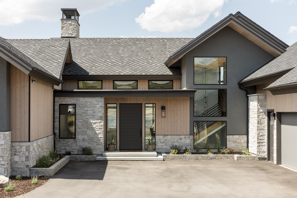
Texture was key to achieving this, and is expressed in both the hard finishes of stone and tile and the soft furnishings and decorative accessories. Dark, saturated tones and accents of warm metals were also important, adding depth and contrast with the light, bright walls and ample windows. However, each of these elements had to be hand selected and placed in the space with care. Too much color or too many busy surfaces could easily disturb the calm and serene nature of this place.
The project evolved as we worked through selections, and the home quickly assumed a strong design direction. Initially, the clients were drawn to more traditional farmhouse elements such as shaker cabinets and shiplap accents. However, the home drifted ever closer to a clean-line and minimalist look as we came to better understand the architecture, views, and massing of the spaces. This home demanded modern fittings and fixtures, and this shift toward modernism made it even more critical to add warmth and depth throughout while being ever mindful of maintaining balance and allowing the windows and views to always stay center stage.
Main Living and Dining Room
The living room fireplace design is a critical feature in this space, and while the clients wanted a TV in the vicinity, it was placed on the side of the fireplace instead of above it, drawing more focus to the fire than the screen. The generous hearth is also key to providing a sense of a cozy gathering area where family members or guests can perch next to the flames while still feeling connected to the main seating area. The texture of the stacked fireplace stone is echoed in the natural materials and textures of the rug, upholstery, and accessories.
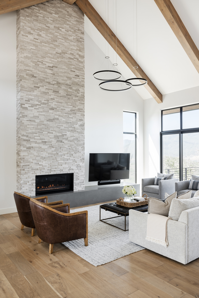
After much discussion, we skipped a traditional dining chandelier in favor of three glowing rings of light positioned high above the living area. With the extra-tall ceilings and show-stopping views, anything hanging in front of the windows would have felt out of place and at odds with the overall design goals of the space. Ample recessed lighting was added in the ceiling, and the dimmable living area pendants create an ambient glow throughout the space at night.
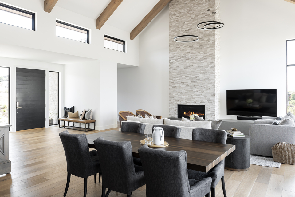
The wide-plank brushed oakwood floors are just the right amount of rustic with their visible knots and graining, perfectly straddling the line between farmhouse and modern styles. We decided against wood window casings throughout the home, instead allowing the black windows to frame the views without any other distractions. Roller shades are tucked away behind each black valance, ready to offer privacy when needed. A warm white shade of paint nearly disappears and blends in with the clouds that often hang above the mountaintops just outside.
The Kitchen
The kitchen is very much at the heart of this home, and it opens to living spaces on each side. With a pair of islands, the kitchen allows for easy gathering on all sides, and a unique flow. The ceiling is dropped here, creating a more intimate and human scale and reinforcing the communal energy of the space. Storage is ample, with a full-height wall of closed storage along one entire side of the kitchen. This houses not only cookware and pantry items but also a generous coffee bar, double wall ovens, and an appliance garage.
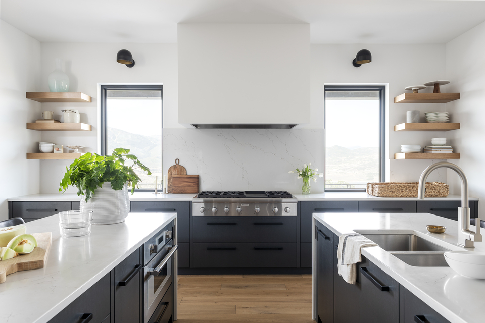
Opposite this hard-working wall are extra-deep storage drawers, a Thermador professional cooktop, and generous windows that extend all the way down to the countertop. Because storage was taken care of so well on the opposite wall, open shelving was added to display special platters and vases acquired during travels abroad as well as prized family cookbooks.
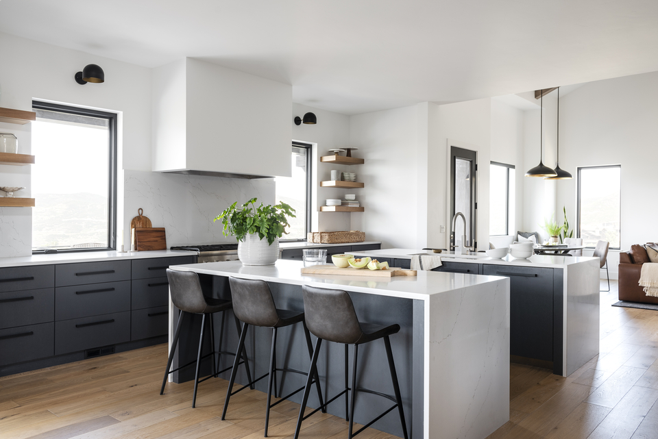
The rift-sawn oak cabinets were painted a deep blue-gray, referencing storm clouds gathering over the mountains on a snowy day. The grain of the oak is visible through the paint, creating another layer of subtle texture. Matte black cabinet pulls also help to enhance this layering effect. The step from blue-gray paint to black metal is soft, compared with the shift to more traditional cabinet pull materials, such as nickel or chrome, that stand out more dramatically. The exhaust hood above the cooktop is wrapped in drywall and painted the same color as the walls. This keeps focus on the two large windows flanking the hood. The quartz countertop wraps up behind the cooktop, and the subtle veining ties to the richness of the cabinet color without obviously matching it.
The Hearth Room
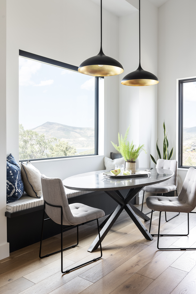
Opposite the open and airy formal living and dining room is a more intimate hearth room that offers a quiet breakfast nook and seating area. While the ceilings are still high, the smaller footprint of the room together with the presence of additional ceiling beams gives the room a strikingly different energy. The use of tobacco-colored leather and a deep midnight rug creates a more masculine atmosphere. The breakfast nook, with bench seating surrounded by more views, also feels snug with exquisite gold and black pendants that bring down the ceiling height overhead. The hearth room will inevitably be used more in the winter months when extra blankets and mugs of coffee will become the perfect additions to this cozy space.
The Powder Bath
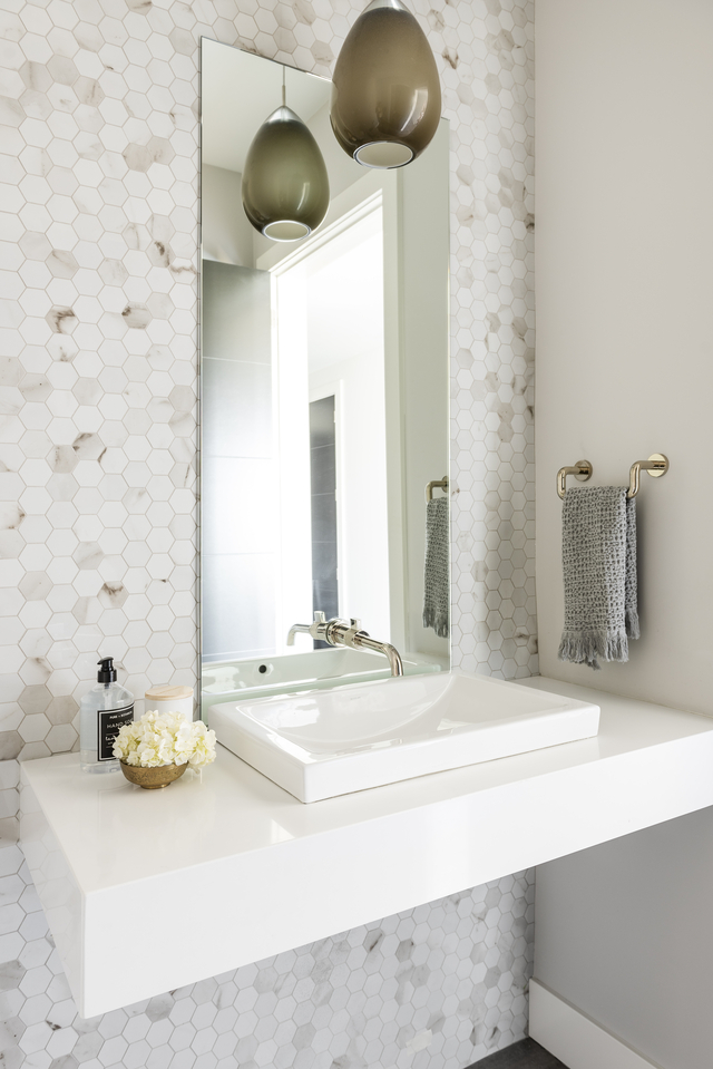
The powder bath offered us another opportunity to add texture, and the entire wall behind the vanity is clad in a warm-colored marble hexagon mosaic tile. To maintain focus on this element, the sink and floating stone vanity are all white, and the mirror is frameless and simple. A large glass pendant hangs over the sink and matches the color of the tile, adding some drama and extra warmth.
The Statement Staircase and Entry
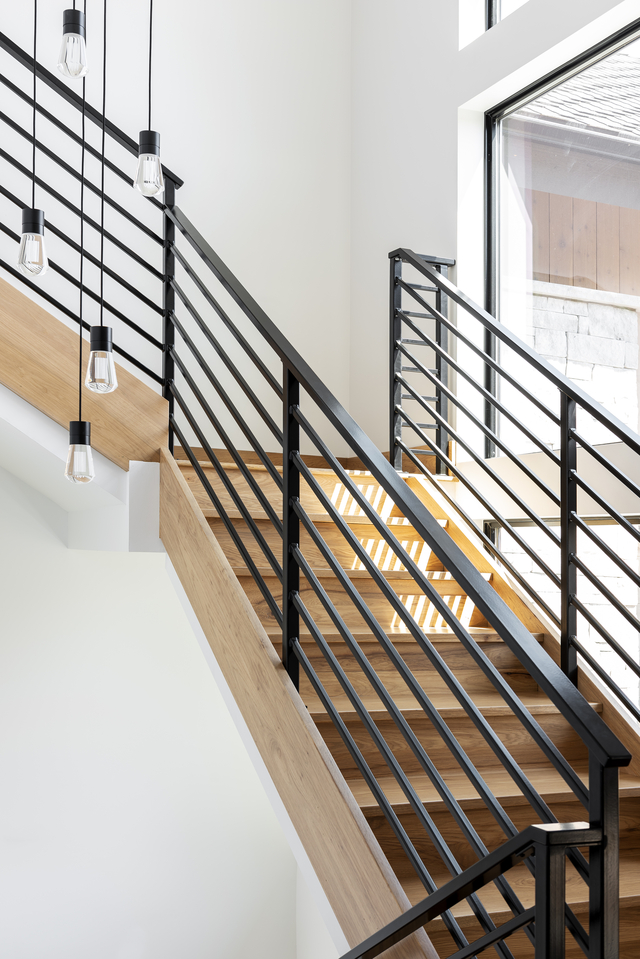
The staircase can be seen through the large vertical windows from the front of the home, so the design is critical to a visitor’s first impression. The stairs lead down to the guest bedrooms and up to a small, loft office space. A dramatic light fixture was key to drawing the eye during the day and especially at night. A modern version of a vintage Edison bulb was selected, this one made of solid crystal with the filament etched into the crystal. A collection of these bulbs cascades down the center of the stairwell, creating interest both inside and out. The dramatically scaled front entry door feels solid and secure. The dark charcoal color adds to this impression, creating a strong visual and emotional barrier between the inside of the home and the outside world. Generous side lights and transom windows above make the space airy and light despite the heft of the door itself.
Lower Level
The walk-out basement level with ten-foot ceilings and ample natural light houses the teenage children’s bedrooms, each with its own en suite bathroom. Similar clean colors and materials were used, but each space was given personality with shaped mirrors and vintage-inspired sconces.
The Master Suite
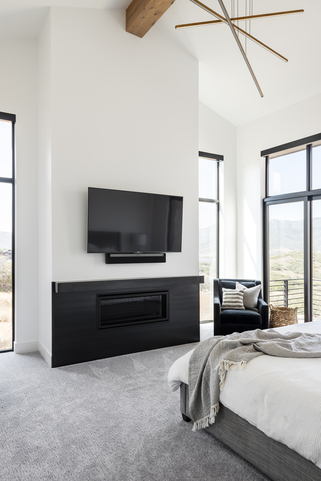
In the master bedroom, a single, hefty wood beam dominates the ceiling, adding warmth and texture to balance the cool bedding and carpet. A dynamic and minimal matte brass LED pendant hangs just below the beam, adding interest without taking away from the views. The fireplace is minimal as well, with a waxed steel surround that wraps up and around the mantle. Swivel lounge chairs in each corner allow for reading spots that seemingly float above the reservoir.
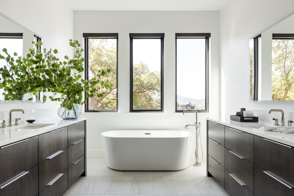
In the generous bathroom, three windows behind the soaking tub frame yet another idyllic view. The light cream tile and countertops together with the warm walnut cabinetry create a serene spa-like vibe. The oversized, extra-deep drawers ensure plenty of concealed storage and minimal countertop clutter.
Written by CHRISTA PIRL; Interior Design by CHRISTA PIRL INTERIORS; Photography by LUCY CALL